Friday, 29 July 2011

Photography


The brief for this assignment was to listen to a song or part of a song and then visually communicate it. This was to teach us to not just take random pictures but to produce photography with a meaning. The song I chose is Devil In A New Dress from Kanye West's My Beautiful Dark Twisted Fantasy album (2010); and the lyric i chose to use is:
                         "and that magic hour
                           i seen good christians make rash decisions
                           oh she do it
                           what happened to religion?
                           oh she lose it"

The concept for my series of photographs was 'the naughty schoolgirl and the catholic priest' as i wanted to play with the controversy of highly religious people going against the Lord's commandments and having pre-marital sex, which the world seems to have forgotten is a sin.

My models are Zama Dlamini and Kelvin Young. A special thanks to Thobani Gambushe, Lungelo Ngcobo and Dennis Bronner for all the help.

Thursday, 21 July 2011

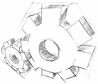
Hang Ten- The Travelling Hoodie_ drawings


Jewellery Design corporate identity_ 2009 Final Exam assignment


As a joint venture, the Graphic Design department briefed us to develop a corporate identity for the senior students from the Jewellery Design department. Sbhekile Lukhele was a student at the DUT in 2009, doing his BTech in Jewellery Design. Sbhekile's jewellery took inspiration from industrial tools and mechanical objects. His designs were complex and he designed for a male market.


"Engineered Jewellery", a fitting name that emplified his design style and his vision. With the understanding for his style of jewellery, I designed a logo for his growing brand. Having been inspired by the technicalities of Sbhekile's sketches, and his concepts for the jewellery he manufactured, I decided to design his corporate identity to resemble technical drawing blueprints. I wanted his stationary to feel like he just sketched an idea roughly on the official letterhead or business card he was sending out.


As a part of the brief, we were put in pairs to each Jewellery Design student as a means of competing for the clients approval. The crux of this 'competition' was that the designer who impressed the client would have their advertorial printed on a brochure of the best Jewellery Design/ Graphic Design collaborations. I am proud to say that my advertorial was selected and it was thus printed on the official 2009 brochure (layout by zola mkhize)...  :-)
I am also proud to say that the Jewellery Design lecturers were impressed by my designs and thus requested that I design an invitation for their department's end of year senior exhibition. This was done after school hours as a favour for them. It was a little more challenging for me as itwas my first non-school related design so i couldn't consult with my lecturers for guidance. I had to put all my skill and experience together, and it came out well.


Angels Nougat Biscuits campaign

 This assignment was one of my favourite ones from second year (2009), as  we were briefed to re-brand an existing biscuit brand. We had a look at the packaging and I then decided to design the brand in a way that would market easily. The packaging I designed aims to grab the customers attention and convince them that this product is light, delicious and heavenly.


The second part of the brief was to create an instore point of sale slideshow that would be played on aisle catchers. I designed four frames that would be easy to read, simple and clear enough to catch the attention of a customer passing by. I also digitally assembled the packaging so as to place it on the shelves, as a means of showing the client how the product would look on the store shelves in comparison  to the other biscuit brands in the same price range. I must say, packaging is my strong suit when it comes to designing.

double page spread _2009 (second year) work


For this assignment, we were given a choice of two articles which we then had to provide illustrations and develop a customised design format for. The article is about 'urban farms' so I interpreted the article visually. To maximise the double page spread design, I designed the body copy into a magazine format. We also had to create a magazine ad for Edgars summer clothing line.

2009 (second year) work


Drawing for design: As a class, we took a field trip to Ushaka Marine World and spent a day there, drawing elements that would offer insight into the aquarium and all the enterainment they have to offer. As part of Design Communications training, we had to merge image and text in a format which would resemble a newspaper advertisement. This was our first project which prompted us to work with body copy...not my finest work. I sure have sharpened my skill through practice.


Surrealism Photography 2009. The brief was to take reference from idioms and photographically describe or illustate them. I chose the well known idiom: "every cloud has a silver lining", meaning that throughout each rough patch or uncertainty, there is always a positive element to that situation, there is always a happy ending. I took photographs of dry burnt down grasslands in Pietermaritzburg, a photograph of the sunrise, photographs of chopped up wood and a photograph of a new sprout of green leaves. After a whole lot of photoshop editing, i arrived at this, the final product.