Tuesday, 15 November 2011

Self Promo!!!


“I’d rather sink, trying to be different than stay afloat like everyone else”... that is the statement that started off my brainstorming for my self promotion assignment. This saying implies that I go against the flow, I work unconventionally, yet I still get the job done and I am still the best.
I wanted to promote that I am commited to Graphic Design, I have mad passion for it and I am eager. After careful consideration, I decided to promote the fact that I am young, open minded and well trained in the skills of 21st century design.I researched Ndebele women, who are naturally artistic amongst other qualities and compiled semiotics of those characteristics. The idea I finally used is a Ndebele girl, illustated in anime style.
My logo represents my cultural background, my illustrative style and my personality. “Homegrown” is the logotype I used, because it reflects on the logo style and it completes my concept.
Having decided on a logo, I decided to extend the logo concept by developing a character for my self promotion, a character that will serve as a mascot. The style of my illustrations is inspired by anime art, which suggests my graphic design training, yet it is also playful and quirky. The colours of the logo and supporting visuals are inspired by ndebele art on their huts, the colours
of the womens’ accessories and their clothing and blankets.
I chose the fonts ‘The Bubble Letters’ and ‘Corbel’ for my self promo. The Bubble Letters’ hand generated and child-like style intrigued me, and it compliments the style of the logo. Its outline style is light hearted and fun. Corbel, on the ether hand is grounded and structured. It is a rounded font which is still somewhat playful and full of ‘character’. Corbel is, however, a contemporary modern font, so it compliments the boldness of ‘The Bubble Letters’.


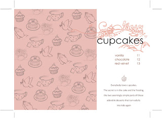
Inspired by the layouts and drawing styles of the last page, i illustrated my cookbook with these elements. The first recipe is Vanilla Cupcakes with a butter cream icing. The second recipe is Chocolate Cupcakes with chocolate Butter Cream icing. I enhanced both these images on photoshop by adding a layer of black abd erasing out the cupcakes at the foreground so the middle and background are blurry somewhat but still add to the mood of the imagery. For my illustrative elements, i did a pattern using elements that told the story of my concept- which is ‘afternoon tea for religious wives and mothers who are neighbours and friends’. I then did a few variations of the pattern in order to have different colours and thus be able to form themes.
For my main illustration, I combined about 5 photographs to compose the drawing. I drew it on illustrator with the brush tool, stroke on 0.25pt, then i exported the drawings and put them together on photoshop and introduced the colour using the brush tool. This illustration was used only for the cover because of its dimensions being too big for any other page. Plus i reckon it makes the cover more interesting, especially when paired with the complexity of the title’s font.

Packaging : fast food packaging range


 I chose to redesign the Debonairs Pizza box as i felt it was the most challenging fast food packaging. Debonairs Pizza has always done a square shaped box for their pizza which, when compared to some American pizza brands, is very unresolved and unimaginative. The drawbacks to the traditional square pizza box is thar it has a low quality look and feel; it is not very sturdy; its hard to dispose of; and the interlocking systems aren’t always effective which often results in leakages.
For my redesign, i considered designing pizza packaging which would encourage reusability, portability, the use of materials that are biodegradable, and a more user friendly (easy to assemble and dispose of ) packaging. For the appearance of the packaging, I proposed to experiment with other geometric shapes to house the pizza. I decided on an octagon as it has eight sides, as the pizza has eight slices. To carry out the packaging theme, I decided to do a Hot Sub box in a similar shape and then invent a Potato Wedges box.


Packaging : vitamin tablet dispenser for arthritis sufferers


The brief asked us to develop a packaging concept for a vitamin product that was specifically marketed at arthritis sufferers. The package will have to be child resistant, easy to open and close, and have a clear indication of the directions of use so anybody can understand.
I had to consider developing a system which would be easy to open, so as to eliminate painful wrist or joint movements, yet be child proof. The medicinal package will have to be simple in its design but have an advanced locking mechanism. With this in mind, I immediately examined the mechanism of a lip gloss container my mom bought for me years ago, which till this day has had people confused over how it opens and closes. It’s the simplest thing, you push the top lid down and hear the lid pop open, then simply squeeze the rim of the lid inwards to close.

This innovative design also encourages reusability as it will be easy to refill the bottle, even if it’ll be for another product. As the medicinal bottle is of the same material and shape as ordinary medicinal bottles, the product should be effective in terms of storage and reusability.

Magazine Editorial Layout


I chose to do my editorial illustration on the “Slaves to the Anguish” article. The article is about emo culture having been misconceptualised as a subculture or lifestyle from having the dark fashion going commercial and the music going viral and popular, whereas being eo still simply means being an emotional teenager who seems to prefer the ‘dark’ side of life. I decided to, instead of creating an image that is  typical to emo culture where there would be sad characters and a grunge texture, I wanted to focus on the notion that being an emo is an emotional, personal, inward thing.

So for my final, approved, illustration I have shown a teenagers hands doodling a teddybear which is cute and ‘innocent’ and a childrens toy but they are stabbing the teddybear with a pin. The image is black and white with the red blood being the pop of colour which is also representative of emo as they crave emotional attention. 


iJusi Typography


Traditional Healers’ are our connection to our past elders. They protect us as we walk the path of life. Our ancestors are our continuous birthmarks, they are who we are and who we were. The afterlife guide the living to be able to perform holistic forms of healing. Bones are thrown on the floor to interpret the message sent from the afterlife and then the patients yell, ‘Siyavuma!’, agreeing with what is being said. The numerous tools used to communicate with our ancestors is what has inspired my font.

“Siyavuma’ is the name of the font. For the design of the double page spread, I decided to have the texture of the two pages be grungy and dark, to reflect the afterlife, the place where the traditional healers go to when they are in a trance, that sense of the unknown. I also wanted the texture to ethnic and to suggest ‘herbs’. 

I had a lot of fun doing this project. It was very challenging but I have definetely grown as a person and as a designer as I have pushed boundaries I hadn’t realised I had set while doing this project.

Hang Ten final design: pictures